So let's take a look, shall we?
Sacramento Kings
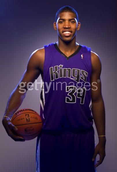
Hmm...not really all that much different here. With the black collar and lack of anything near the shoulder area, this sorta looks like one of those cheap t-shirt jerseys that you can get at Sports Authority, Modells, and other sporting goods stores. This jersey is really more of a metaphor for how the Maloofs and those within the Kings organization are treating the team as of late: "We really don't give a crap about the team...so just toss some generic product out there and call it 'New and Improved'". I maintain my sympathy for Kings fans who are watching their team once again plummet to the depths after a really successful run during the Divac days.
Minnesota Timberwolves
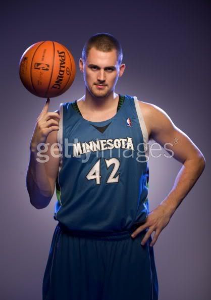
The team scored some points for the new logo they unveiled, even if it was a carbon copy of the Mavericks logo, but this...well THIS is just friggin' awful. Look at that name font. Look at that drab color. For heaven's sake, LOOK AT THAT COLLAR! If there was ever a mish-mash of Kevin McHale's insanity, this is it. I was hoping they would keep the pine trees, as it was a rather creative and original idea to have them on the jersey in the first place, but they are somehow partitioned off to the sides of the collar. The only thing that could possibly make this sillier is if the jersey was modelled by some out of shape guy who is staring down the camera like a creepy outtake from "Deliverance". Someone get Kevin Love on the phone, stat!
Orlando Magic
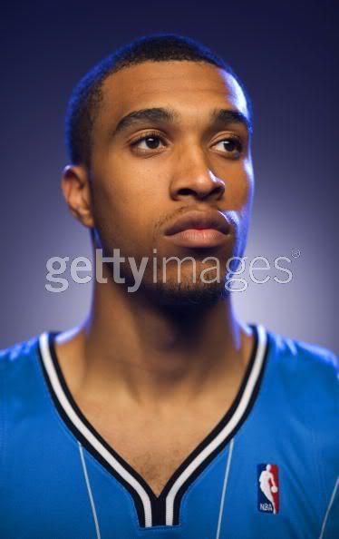
We're only getting a look at the tippy-top of this jersey since the team is keeping it a secret until a former unveiling, but already America can see into the future: These new Magic jerseys are going to look a bit weird. It looks like Magic rookie Courtney Lee had a zipper on the front of his jersey and pulled it down, as if to say, "Take a look at my manly chest hair." Now imagine an entire TEAM of people looking like they are showing off their chest hair (especially hairy folks like Turkoglu) and you have what will either be the ugliest collection of jerseys or the best retro disco-era jersey of all time. As a Magic fan, I'm hoping for the latter. If they replace the basketball in the Magic logo with a disco ball, consider me sold.

7 comments:
Kings: I like them. Kind of plain at top, but I like the classic styling of the sides. My favorite of the three.
T-Wolves: Good god. Horrible all around. Looks like they went with the crappy "multi-colored shapes" sides that the Bobcats are sporting.
Magic: Not liking them too much. Somewhere inbetween the new Kings and T-Wolves ones. Collar is too big, and the pinstripes are f-ing retarded (compared to how normal pinstripes looks...LIKE THE ONES ON OUR ORIGINAL UNIS THAT THE FANBASE HAD BEEN ASKING FOR). Seriously, wtf..
I don't understand the Minnesota jerseys. I'm confused on how the collar is being cut off from the borderlines side to side to leave the black triangle lone and isolated. The worst I seen in years. The Magic unis is that I am not crazy about them. The new stripes style is bizarre and looks weird. The Kings unis impressed me because they kept it simple to make it look great.
I haven't seen one positive comment about the new T-Wolves unis anywhere.
As for the Magic ones, I wish they went with a more classic pinstripe design as I mentioned before, but after seeing some mock-ups, they could end up being pretty decent.
It looks like the collar area is really big in the Lee photo, but it's possible/probable that he was wearing a bigger jersey than normal players wear - since that's what he did in college as well.
It's also slightly possible that what we saw in the photo is not the final product (but I'm guessing it is), since we only saw the top of it while we got to see full versions of both the T-Wolves monstrosity and the new Kings unis.
These teams are all on crack.... especially Minnesota and orlando.... and the wolves are my team!
http://ciciky57213.5gbfreehost.com/
http://ciciky57213.5gbfreehost.com/sitemap.html
http://cqpodi84479.5gbfreehost.com/
http://cqpodi84479.5gbfreehost.com/sitemap.html
http://kakode17764.5gbfreehost.com/
http://kakode17764.5gbfreehost.com/sitemap.html
http://pikusq99253.5gbfreehost.com/
http://pikusq99253.5gbfreehost.com/sitemap.html
http://vebuky3930.5gbfreehost.com/
http://vebuky3930.5gbfreehost.com/sitemap.html
http://vevixa72766.5gbfreehost.com/
http://vevixa72766.5gbfreehost.com/sitemap.html
adobe illustrator torrent
kodak adobe photoshop
a fools guide to adobe photoshop cs3
adobe flash player problems
adobe photoshop cs2 serial number keygen
adobe premiere with jvc everio
I usually don't post in blogs but your blog forced me to, amazing work.. beautiful !
Post a Comment
Leave us a comment, should you want to be rich and famous.